


Hello,
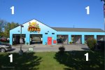
We are about to buy a new car wash and working out new color schematics for it. We are changing the name to "Safari Car Wash" and here are some graphical representations of the color schematics we came up with.
Would appreciate if you vote the best one among these and help us finalize the best.
Thanks.
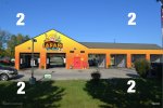


")
